
 In this tutorial, we explore several ways to make your non-mobile responsive WordPress site mobile friendly.
***
How To Make Your Non-Mobile Responsive WordPress Site Mobile Friendly
People are now using mobile phones more than desktop or laptop computers to access information online. Your website, therefore, needs to get mobilized or you will risk losing many valuable opportunities online.
 Optimizing your website for mobile devices or even creating a mobile site from scratch isn’t hard to do and doesn’t require you to become a web developer or web designer.
To learn more about the importance of making your WordPress site mobile friendly, see the tutorial below:
Although nowadays it’s quite difficult to get a new WordPress site built that is not mobile responsive, you may be using an older theme that is not mobile friendly. When it comes to getting your WordPress site mobilized, you have a few options. For example, you can:
- Convert your existing “non-mobile-friendly” website into a mobile site using various online services,
- Create mobile landing pages (or even a complete mobile site) from scratch using software applications,
- Use mobile conversion or “switcher” plugins,
- Switch to mobile-enabled or mobile responsive WordPress themes.
Let’s go through each of the above options.
Convert Your Existing Site Using An Online Service
If your existing WordPress site is not mobile-ready, you can easily convert it into a mobile site using a one-click conversion service like Duda Mobile.
Duda Mobile
 Features of this mobile site conversion software include:
- Works seamlessly with WordPress
- One-click conversion optimizes your website for phones with a web browser (converts your existing website into a mobile friendly site)
- Automatically syncs with your regular website (any changes you make to your regular website are automatically updated in your mobile site for free)
- Free mobile analytics helps you keep track of all your mobile website traffic and site visitors
- You can choose a design from dozens of stunning looking mobile website templates
- Built for non-techies – You don’t need to be a website designer to create a mobile site
- Optimized for all smart phones – works on major smartphones including iPhone, Android, Blackberry and Windows Mobile
- Advanced design studio lets you customize your mobile site with an advanced template editor.
- Add a click-to-call button to make it easy for your customers to contact you.
- Send your business info to your mobile site visitors using a simple text message via SMS
- Add a mobile map to your site with step-by-step directions to your business
For more details, visit the site below:
Create A Mobile Site Or Mobile Custom Landing Pages Using Software
Mobile landing pages are great for presenting visitors with coupons, special offers, newsletter sign-up forms, etc.

If you want to create a mobile site or custom landing pages to send your visitors to from scratch, then take a look at a software tool like the EZMobile Site Generator plugin for WordPress.

Some of the built-in features of this plugin include:
- Fully Customizable Layouts
- Multi-level Navigation Menus
- Customizable Contact Form
- Interactive Maps
- Customizable Opt-in Forms
- Opening Hours/Product Lists/Restaurant Menus
- 300+ Icons each in 5 different colors
- Unlimited Customizable Themes
- Automatic Screen Resizing
- SEO Optimization
- QR Code Generator (see next strategy to learn what this is …)
- Interactive Site Preview
- Redirect to External Sites
- And more …
For more details about this software, visit the site below:
Use Mobile-Enabled WordPress Themes & Mobile Detection Plugins
Responsive Web Design (RWD) is a Web design approach aimed at crafting sites to provide an optimal viewing experience—easy reading and navigation with a minimum of resizing, panning, and scrolling—across a wide range of devices (from mobile phones to desktop computer monitors).
A site designed with RWD adapts the layout to the viewing environment by using fluid, proportion-based grids, flexible images, and CSS3 media queries …
(Source: Wikipedia.org)
Many WordPress themes are now designed to be mobile-ready, or “responsive”. What this means, is that your website will display your site’s normal theme to visitors when viewed through their desktop PC or laptop computer, and automatically resize their screen to adapt to the new viewing device, or switch to a mobile version of the theme when the site is accessed through a mobile device.
For example, take a look at the site below. It uses a responsive WordPress theme called Bhinneka.
When viewed on a desktop PC, the site looks like this …
 (Bhinneka WordPress Theme – Desktop View)
But when the site is accessed via a mobile device, the theme automatically resizes to display the same site in a mobile viewing format …
 (Bhinneka WordPress Theme – Mobile View)
In this case, the theme designer has created one WordPress theme that works on all platforms (i.e. desktop PCs, laptops and mobile devices).
WordPress Mobile Switcher Plugins
If your WordPress theme is not mobile compatible, then the other option you have is to use a WordPress mobile “switcher” plugin that will automatically detect if visitors are coming to your site from a mobile device and display a mobile theme to your visitors.
Here are some mobile switcher plugins you can check out:
WordPress Mobile Pack

(WordPress Mobile Pack)
The WordPress Mobile Pack is a complete toolkit to help mobilize your WordPress site and blog. It includes a mobile switcher to select themes based on the type of user that is visiting the site, a selection of mobile themes, extra widgets, device adaptation and a mobile administration panel to allow users to edit the site or write new posts.
To download this plugin, visit the site below:
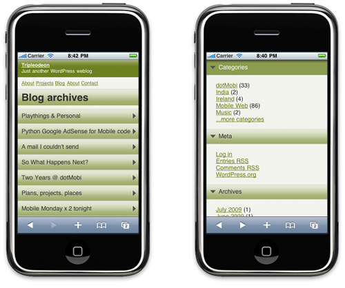
WP Mobile Detector Mobile Plugin

(WP Mobile Detector Mobile Plugin)
The WP Mobile Detector WordPress plugin automatically detects if your visitor is using a standard mobile phone or a smart phone and loads a compatible WordPress mobile theme for each.
This plugin can differentiate between a standard mobile phone and a smart phone. It also features advanced mobile statistics, image resizing, automatically formatted content, collapsible menus, dynamic page loading, cross-platform compatibility, touch-optimized layouts, widgets and detection of 5,000+ mobile phones.
The WP Mobile Detector plugin is compatible with most other mobile detection plugins and includes an installer that will configure everything automatically. All you have to do is install and activate the plugin.

To download this plugin, visit the site below:
WordPress Mobile Redirect

(WordPress Mobile Redirect)
WordPress Mobile Redirect/Detect is a small plugin that can detect most of popular internet enabled mobile devices and redirect according to URL you provide. It is also easy to customize redirect URLs and devices …

To learn more about this plugin, visit the site below:
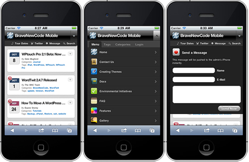
WPTouch

(WPTouch)
WPTouch automatically transforms your WordPress website or blog into an application-like theme, complete with ajax loading articles and effects when viewed from the most popular mobile web browsing devices like the iPhone, iPod touch, Android mobile devices, Palm Pre/Pixi and BlackBerry OS6 mobile devices.
The admin panel allows you to customize many aspects of its appearance, and deliver a fast, user-friendly and stylish version of your site to touch mobile visitors, without modifying a single bit of code (or affecting) your regular desktop theme.
This theme also includes the ability for visitors to switch between WPTouch view and your site’s regular theme.
See the video at the end of this tutorial to learn how to install and configure the WP TouchWordPress plugin.
To download this plugin, visit the site below:
WordPress Mobile Themes
Here are some WordPress Mobile Themes you can look at …
Wow! mySite WordPress Mobile Theme
 (Wow! MySite WordPress Mobile Theme)
Theme Description
WOW! mySite is a WordPress theme optimized for mobile devices. With WOW! mySite you design your own mobile website with nine customisable preset color schemes, powerful theme configuration options and multiple page templates. Add your own high resolution logo, custom fonts and shortcodes and fine tune with WOW! mySite’s unlimited color options whilst maintaining the style and branding of your desktop website.
It is suitable for both corporate and personal use and for non-technical users with very limited WordPress experience and for programmers with technical know-how. WOW! mySite is easy, simple and fun to use… The only limitation is your imagination!
For more information about this theme, visit the site below:
Simple Mobile WordPress Theme

(Simple Mobile WordPress Theme)
Theme Description
The Simple Mobile theme is a WordPress mobile theme designed especially for mobile devices like the iPhone. It can be used in parallel with the regular version of your website and presented to mobile users only.
Or, you can present it both to desktop computers and mobile devices users. This theme features 8 color schemes, easy further customization (PSD included), JavaScript Twitter implementation, Flickr photostream implementation, and over 40 social media icons.
For more information about this theme, visit the site below:
WordPress Stacker Mobile Theme

(WordPress Stacker Mobile Theme)
Theme Description
Stacker is a fully responsive WordPress theme for mobile with many great features, including custom mobile navigation, shortcodes, widget areas, templates and support for every mobile resolution/platform.
For more information about this theme, visit the site below:
mobiTheme WordPress Mobile Theme

(MobiTheme WordPress Mobile Theme)
Theme Description
mobiTheme is a mobile theme for WordPress. It can be used either as a standalone blog OR in conjunction with one of the many plugins that offer theme switching according to the users platform.
Although compact in design, this theme offers all the features to the user that a normal WordPress blog theme has to offer. In other words, it doesn’t cripple the users browsing experience by hiding archives and categories selection and other browsing options.
The mobiTheme WordPress theme can be used straight out of the box with no plugins required. This theme also has two built-in widgets and a widget ready area to allow for greater expansion, plus a built-in Twitter widget.
For more information about this theme, visit the site below:
H8.mobile WordPress Mobile Theme

(H8.Mobile WordPress Mobile Theme)
Theme Description
According to this theme’s developer, the H8.mobile WordPress mobile theme has been tuned to look perfect in mobile browsers. The markup is device orientation (landscape/portrait) sensitive, so when visitors change their device orientation by rotating it 90 degrees clockwise or counterclockwise this template will configure itself appropriately.
The theme also supports the swipe gesture on image sliders and is ideal for a mobile blog or magazine, or even a mobile portfolio.
For more information about this theme, visit the site below:
Bhinneka WordPress Theme

(Bhinneka WordPress Theme)
Theme Description
Bhinneka is a highly responsive WordPress theme with two-column page layouts, slideshow support, three alternative styles, shortcodes, custom widgets and drop down menus. It is also an ideal theme for a non-profit organization, charity, or corporate website.
For more information about this theme, visit the site below:
Choosing The Best Solution For Your Mobile Needs
By far the easiest way to create a “mobile-friendly” experience for your users, is to simply install a “responsive” theme. Most theme design companies provide responsive themes.
To view responsive WordPress themes for your site, visit the sites below:
To learn more about where to find the best WordPress themes, see the tutorial below:
You may already be committed to using a particular theme and discover that your theme is not responsive or mobile friendly. In this case, choose one of the other solutions (i.e. conversion tools, or “switcher” plugins).
Congratulations! Now you know how to make your non-mobile responsive WordPress site mobile friendly.

(Source: Pixabay)

***
"I was absolutely amazed at the scope and breadth of these tutorials! The most in-depth training I have ever received on any subject!" - Myke O'Neill, DailyGreenPost.com
***