How To Add Charts And Graphs To WordPress
No doubt you’re familiar with the saying “a picture is worth a thousand words.” This is certainly true when you are trying to present and explain data.
Using graphs and charts is a great way to break up long chunks of technical information, and make technical or statistical data more easily digestible.
You can present data using tables, but if you want your audience to try and make sense of complex data with figures, percentages and comparisons more easily, then charts and graphs let you present data in a meaningful and intelligent way that can be quickly processed.

Graphs and charts help you explain complex information so people can more easily interpret it!
Need to add charts and graphs to your WordPress pages and posts? This step-by-step tutorial shows you how to use WordPress Visualizer – a simple, easy to use and powerful WP plugin that lets you create, manage and insert great-looking graphs and charts into your WordPress posts and pages in just a few mouse clicks that:
- Your visitors can engage with
- Allows you to add graph or chart data from your computer or a web-based data source
- Resizes dynamically for mobile browsing
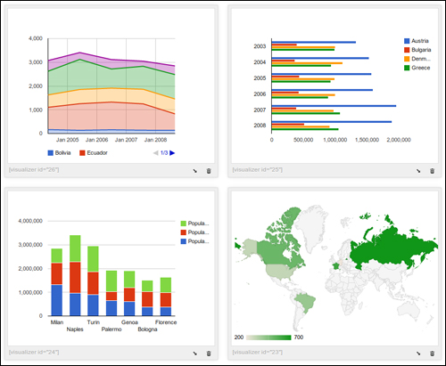

If you are displaying visual data like pie charts, comparison bars or trending graphs that contain static information (e.g. historical data), an easier way to present this data is to create your graphs or charts using a desktop application, convert these into images and then simply add your images to your post or page.
Use WordPress Chart & Graph Plugins
If you want to create dynamic bar charts and pie graphs in WordPress with no coding skills required, the easiest way to do this is to use a plugin.
Fortunately, there is a plugin for WordPress users that is simple to install, easy-to-use and allows you to not only create appealing and mobile-responsive graphs and charts, it also lets you populate your charts and graphs with updateable information.
Visualizer
Plugin URL
You can install the plugin from your WordPress dashboard (we explain how to do this further below), or access and download the Visualizer plugin from the link below:
http://wordpress.org/plugins/visualizer
Visualizer Plugin Description
WordPress Visualizer is a simple, easy to use and powerful plugin that allows you to create, manage and insert mobile-responsive charts into your WordPress posts and pages in a few mouse clicks.
WordPress Visualizer uses Google Visualization API to render charts, which support cross-browser compatibility (adopting VML for older IE versions) and cross-platform portability to iOS and new Android releases, and are based on pure HTML5/SVG technology (adopting VML for old IE versions), so no additional add-ons are needed.
Visualizer also provides a variety of charts optimized for all your data visualization needs, including:
- Line chart
- Area chart
- Bar chart
- Column chart
- Pie chart
- Geo chart
- Gauge chart
- Candlestick chart
- Scatter chart
WordPress Visualizer is also flexible and customizable, allowing you to use Google Chart Tools with their default setting, or configure an extensive set of options to match your web design. Various options are available for each chart that let you fully customize their settings.
Additionally, charts are rendered using HTML5/SVG technology to provide cross-browser compatibility (including VML for older IE versions) and cross platform portability to iPhones, iPads and Android devices. Your visitors can see your charts and graphs on their mobile web browsers without having to install any extra plugins.
How To Install The Visualizer Plugin
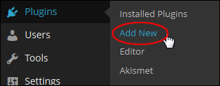
From your WP dashboard, select Plugins > Add New from the main admin menu …
In the Add Plugins page type search for “visualizer” and hit enter …
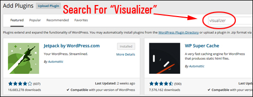
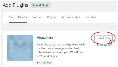
Locate the plugin in the search results section and click Install Now …
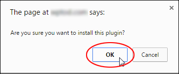
Click OK to proceed …
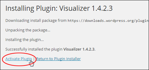
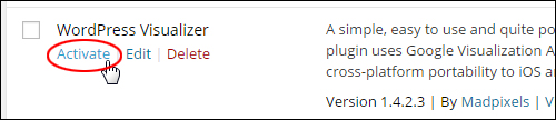
Activate the plugin …
You can also activate the plugin in the Plugins area …
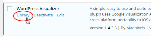
After the plugin has been activated, click on Library …
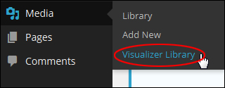
You can get to the plugin’s ‘library’ screen by selecting Media > Visualizer Library in your main menu …
This takes you to the plugin’s Visualizer Library section …
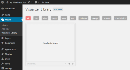
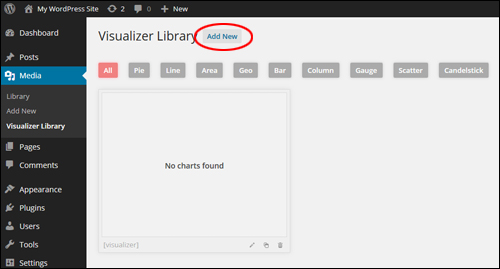
When you first install the plugin, the library section will be empty.
The next step is to add add charts and graphs to your library.
How To Configure Visualizer
To add a new chart or graph to the plugin’s library, click on ‘Add New’ …
You will see all of the kinds of charts and graphs available.
Select the type of graph or chart you would like to create and click on the ‘Next’ button …
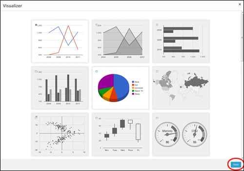
The graph/chart type will open up in a lightbox.
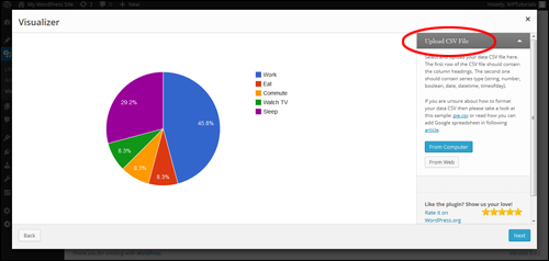
The next step is to upload a CSV file with your data …

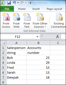
When creating your CSV data file, ensure that:
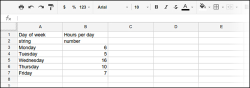
- Your first row includes your column headings.
- Your second row includes the series type (e.g. number, timeofday, etc.)
The screenshot below shows how to format your data …
If you are unsure about how to format your CSV file, simply use the sample that comes with the plugin.
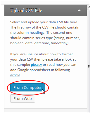
Next, select your data source (‘From Computer’ or ‘From Web’) in the ‘Upload CSV File’ section.
Upload CSV File From Computer
To upload a CSV file and data from your computer select ‘From Computer‘ …
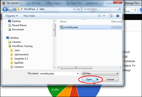
Use the browser to locate and select your file and then click on ‘Open‘ …
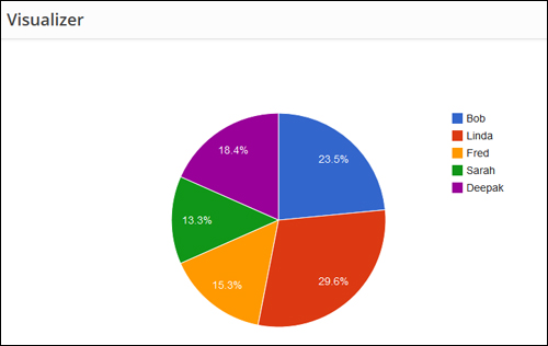
The plugin will import your data from the CSV file and display it using the graph/chart type you have selected …
Upload CSV File From The Web
For a tutorial that shows you how to create, save and publish data to a Visualizer chart or graph using Google Spreadsheet, see the article below:
After importing your data, make sure that all of your information is correct (if not, click on the ‘Back’ button and reupload a new data file containing the correct data), and click ‘Next‘ …
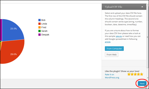
Depending on the chart or graph type you’ve selected, the plugin will display a range of customization settings and options …
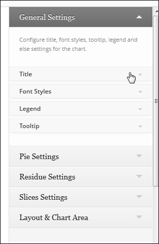
Visualizer gives you total control over your information, and updates your display in real time …
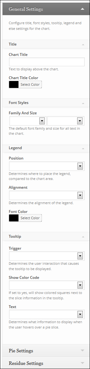
For example, the pie chart offers many configurable options, such as:
- General Settings – Configure chart title settings, font styles, tooltip, and legend.
- Pie Settings – Create 3D pie charts, draw slices counterclockwise, set the text content displayed on the slice, create a “donut” pie chart, rotate the chart’s “start” angle and set the slice border color.
- Residue Settings – Set the ‘Visibility Threshold’ (the slice relative part, below which a slice will not show individually.), ‘Residual Slice Label’ (the label for the combination slice that holds all slices below slice visibility threshold, e.g. “Other”), and ‘Residue Slice Color’.
- Slice Settings – Customize the ‘Slice Offset’ (how far to separate the slice from the rest of the pie), and ‘Slice Color’.
- Layout & Chart Area – Configure the layout (total size of chart) including the width and height of the chart as a number of percentage, background color for the main area of the chart and the chart border width and color, and the placement and size of the chart area (where the chart itself is drawn, excluding axis and legends).
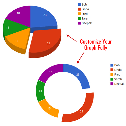
Once you are satisfied with the look of your graph or chart, click Create Chart …
Your chart or graph will be added to the ‘Visualizer Library’ section …
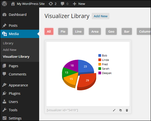
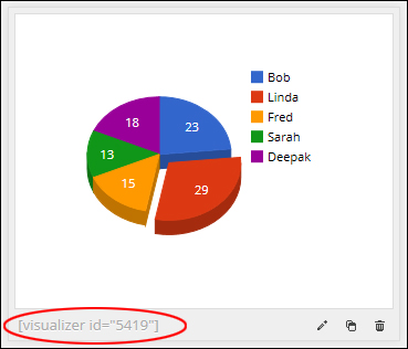
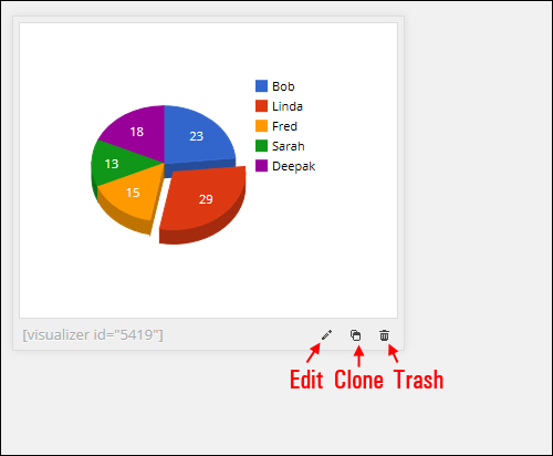
Note that each new element is given a unique ID displayed as a shortcode. As you will see very soon, this lets you add charts and graphs to your posts and pages quickly and easily …
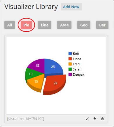
Charts and graphs added to the Visualizer Library can be accessed by their type …
After adding a graph or chart to the ‘Visualizer Library’, you can edit it, duplicate it, or trash it …
Visualizer Usage
After creating a new chart or graph and adding it to Visualizer, it’s easy to add it to your posts and pages.
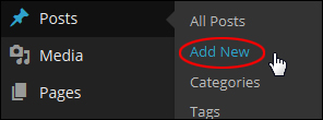
First, create a new post or page (or open an existing one) …
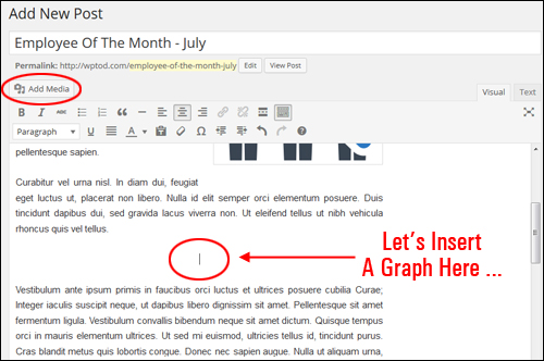
Next, place your mouse cursor where you want to insert your visual element into your content and click on Add Media …
Click on ‘Visualizations‘ …
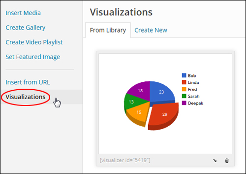
Select the element you want to add to your content and click the “insert” icon …
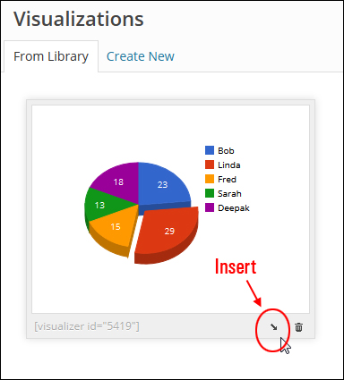
This will place a shortcode into your content …
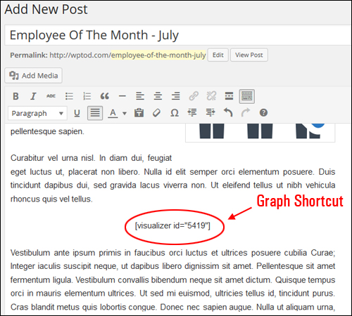
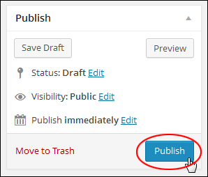
Once you have finished adding your shortcode, click on Publish to publish (or update) your content …
After the post/page has been published, click ‘View post’ to see the result …
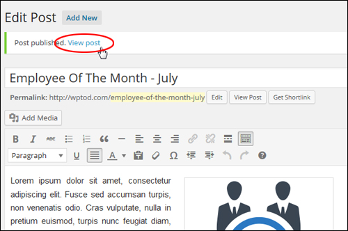
You will see your item in your content …
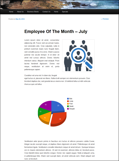
As mentioned earlier, Visualizer also displays responsive charts for mobile browsers …
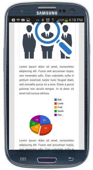
As you can see, the Visualizer plugin allows you to add and customize dynamic charts and graphs in your content. You can modify your data and the changes will automatically be reflected throughout your website. This makes managing interactive graph data in WordPress really efficient.
The developers of this plugin have created a number of tutorials you can use to learn how to edit, customize and use Visualizer.
For additional tutorials on editing, copying, deleting and adding data to your charts, visit the site below:
Congratulations! Now you know how to add appealing and dynamic charts and graphs to your WordPress content with WordPress Visualizer plugin.
***
"This is an awesome training series. I have a pretty good understanding of WordPress already, but this is helping me to move somewhere from intermediate to advanced user!" - Kim Lednum
***