 Adding a contact form to your site allows visitors and prospective new customers to contact you if they have questions, concerns or problems.
A contact form also encourages more visitor interaction on your site, builds trust, and allows you to generate new leads and inquiries for your products and services.
***
How To Add A Contact Form To WordPress
In this tutorial, we show you how to install a contact form into your site’s “Contact Us” page using a FREE WordPress plugin called Fast Secure Contact Form.
Fast Secure Contact Form Plugin

(Fast Secure Contact Form WP plugin)
Plugin URL
https://wordpress.org/plugins/si-contact-form/
Plugin Description
This plugin allows you to easily create and add contact forms to WordPress. The contact form will let your site visitors email you and even send a meeting request to talk with you over phone or video.
You can create and preview unlimited forms with this plugin …

The Fast Secure Contact Form plugin also includes CAPTCHA and Akismet support to block all common spammer tactics …

Plugin Installation
From your WP admin area, select Plugins > Add New …

Select the Install Plugins > Search tab, then type in “fast secure contact form” into the search field and click on the Search Plugins button …

The plugin you are looking for was developed by Mike Challis. Locate the plugin in the search results area and click Install Now …

Once the plugin has been installed, make sure you activate it …

After the plugin has been activated, click on Settings …

You can also get to the plugin’s settings screen by selecting Plugins > FS Contact Form from your dashboard menu …

This brings you to the Fast Secure Contact Form Settings page …

Plugin Configuration
![]()
This tutorial focuses on showing you how to set up a contact form on your WordPress site using a plugin. It is not meant to provide a detailed user manual covering every aspect of the Fast Secure Contact Form plugin used in this tutorial.
For detailed documentation on the Fast Secure Contact Form plugin, go here:
Although Fast Secure Contact Form provides many configurable options, you can easily create a simple, working contact form very quickly by following the steps below:
First, create a new page and call it something like “Contact Us” (or ”Support”, etc.) …

Leave the content section blank for now and publish your page …

We’ll come back to this page after configuring your contact form settings.
Choose Plugins > FS Contact Form on your WP admin menu to go back to your plugin settings …
Now, let’s start configuring your contact form settings.
![]()
Tip: You can preview how your contact form looks any time after saving your changes, by clicking on the ‘Preview Form’ button at the top of the settings page (make sure the correct form is displayed in the ‘Select a Form:’ drop-down menu) …

A preview of your contact form will display inline, so you can see what you have configured so far …

To return to the screen you were previously working on, click on Edit Form …

Let’s configure your form settings now …
Basic Settings > Basic Settings
In the ‘Basic Settings’ section, note the following:

- Shortcode for this form: This is the shortcode that you will need to insert into your ‘Contact’ page (or anywhere else in your site where you want this contact form to display).
- Form 1 label: Enter a name for your form here. This is not visible to users, it just helps you keep track of what you are using the form for. You can also include this label in the subject line of your contact form submissions (see section below).
- Welcome introduction: Type in here any text that you want displayed before the form (i.e. a message to visitors, instructions, expected response times, etc.). You can use HTML to format your message. ***
- Help – Click on the ‘help’ links if you need help with any of the configuration settings.
- Save Changes – Click on the ‘Save Changes’ button as you configure the settings for each tab and remember to save as you go.
*** Here is an example of a Welcome introduction message containing text formatted with some simple HTML tags (line breaks, bold, italics and underlines) …

When the above is published, your form will look like this …

Basic Settings > Email Settings
In the Email Settings section, all you need to do is confirm the email address you want all contact form submissions to be sent to …

Email To:
The plugin will automatically add the email address specified in the WordPress General Settings section to the ‘Email To:’ field, but you can replace this email with any email address you want messages from this form sent to.
For example, depending on what the contact form is being used for (e.g. support, leads, general enquiries, etc.) you can have all contact form messages and communications sent to a support staff, an assistant, your sales department, etc …
Similarly, you can change the ‘Webmaster’ salutation in the ‘Email To:’ field to whatever you want (e.g. ‘Bob Smith’, ‘Sales Dept’, etc …). Just remember to keep the format in this field (i.e. separate recipient and email address with a comma).
Email Bcc address (optional):
If you want to Bcc (Blind Carbon Copy) contact form submissions to other recipients, enter their emails into this field, e.g. user1@somedomain.com (single recipient), or user1@somedomain.com,user2@anotherdomain.com (multiple recipients)
Email subject prefix:
Replace the default subject prefix in this field if you want to. You can also add the following “tags” to the subject line:
- [from_name] – Include the name of the form sender in the subject line.
- [from_email] – Include the sender’s email address in the subject line.
- [form_label] – Include the name of your form in the subject line.
Return-path address (recommended): As the plugin developer states in the help notes for this option:
Server email address the messages are sent from. Some web hosts do not allow PHP to send email unless the Return-path email address is set. It must be set to a real email address on your site domain, or mail will NOT SEND! (They do this to help prevent spam.)
If your form does not send any email, enter your site email address, then test the form again. This setting is required by Dreamhost, GoDaddy, many others, and is also recommended for gmail users to prevent email from going to spam folder.
Enter just an email: user1@example.com
Or enter name and email: webmaster,user1@example.com
For best results the “Email To” and the “Return-path address” should be separate email addresses on the SAME DOMAIN as your web site.
Enter a return-path email address into this field.
Leave all other settings in this section as they are and click on the Save Changes button to update your plugin settings …

After saving changes in your ‘Basic Settings’ tab, click on the ‘Fields’ tab …

Fields
This brings up the ‘Field Settings’ section …

Fields > Field Settings
The ‘Field Settings’ section lets you configure all of the fields that will be included in your contact form. For example, you can:
- Specify different labels for your fields (e.g. change “Name” to “First Name”, or “Your Name”, etc …)
- Rearrange the order in which fields display on the form.
- Add extra fields to your form (e.g. phone number, company name, etc.)
- Select field types (e.g. text, text area, email, checkboxes, radio buttons, multiple selections, URLs, date, password, hidden fields, etc.)
- Specify which fields are required (i.e. the contact form will not be submitted unless the required fields are completed).
Field Settings – Notes
Field Labels must be unique. The Labels on the default standard fields (Name, Email, Subject, Message) cannot be changed in this section, but you can change the label that displays on the form on the Labels tab …

For help with this section, click on the ‘View instructions for fields’ link …

This brings up a detailed help section for this area …

To edit field details, click on the Show Details button to the right of the field …

The field expands to show a number of configurable options and additional settings for that specific field, including the ‘Required field’ option (keep the checkbox ticked if you require users to complete this field before submitting the form) …

To rearrange the order in which fields display on the contact form, click on an area outside of the field text boxes and drag it into the new desired position …

The new field order will be saved when you click Save Changes …

To add extra fields to your contact form, click on the Add New Field button …

Note: If you have not saved changes on your form, a message window will pop-up informing you that changes will be lost if you continue. Click Cancel and save your changes before proceeding, or click OK to ignore this message …

A new field will be added to this section …

Edit the field and the field details then click Save Changes to add the new field to your form.
To temporarily disable a field in your contact form, click on the Show Details button …
Click on the ‘Disable field’ checkbox and save the settings for this field …

The field will be marked as ‘DISABLED’ …

To delete a field, click on the Show Details button …
Click on the Delete Field button …

A message will appear asking you to confirm the field deletion. Click OK to proceed, or Cancel to abandon the procedure …

The field will be permanently deleted when you save your changes.
Field Settings > General Field Settings
The ‘General Field Settings’ section lets you specify a number of settings that affect your contact form fields …

Leave the default settings for this section, or configure these to suit your needs.
You can configure the following settings in this section:
- Date and time field settings
- Acceptable file types that users can upload and send to you as an attachment (e.g. screenshot images and pdf documents). Any file type not listed in this section will be rejected.
- Maximum size allowed for attachments.
- Whether or not form users can format their message using HTML tags (e.g. bold or italicize words, enter clickable hyperlinks, etc.). This setting is disabled by default for security purposes. Enable this option only if you want users to be able to send HTML code in the textarea extra field types. HTML code allowed will be filtered and limited to only a few safe tags.
- Whether or not to remove white spaces in the message field. Normally white space is removed, but you can opt to preserve it.
After configuring the settings in the ‘Fields’ section click on the Save Changes button to update your plugin settings …
After configuring the ‘Fields’ section, the next tab is the ‘Styles’ settings …

![]()
Unless you need to configure the settings in this section, use the default settings and continue to the next section.
Styles
The ‘Styles’ section lets you configure a number of settings that affect how elements of your contact form will display on your site, such as CSS styles, alignment, labels, inputs, buttons, and text …

Like all other aspects of this plugin, extensive help and information is provided about each of the options in this section.
The next configurable section after ‘Styles’ is ‘Labels’ …

![]()
Unless you need to configure the settings in this section, use the default settings and continue to the next section.
Labels
The ‘Labels’ section lets you edit the text that displays on your contact form and configure options related to your form’s labels …

For example, let’s say that you want to change one of the labels on your contact form …

You would locate and edit this label in the ‘Field Label Settings’ section, and save your changes …

Your contact form will then be updated to display the new label …

You can completely customize your forms and override default labels by editing the form’s field labels, tooltip labels, and error messages …

The next configurable section after ‘Labels’ is ‘Security’ …

![]()
Unless you need to configure the settings in this section, use the default settings and continue to the next section.
Security
The ‘Security’ section lets you configure settings for your form’s CAPTCHA, Akismet spam prevention and domain security …

Security > CAPTCHA Settings
A CAPTCHA form (Completely Automated Public Turing Test To Tell Computers And Humans Apart) prevents automated spam bots and form-filling robots from using the contact form to send you spam by requiring that the user pass a test that only humans can pass before the form can be submitted.
You can enable or disable the CAPTCHA form, make the CAPTCHA image smaller, hide it for registered users and enable a hidden spambot trap.
Security > Akismet Settings
The form also uses Akismet to help prevent spam when the Akismet plugin is installed and activated on your site.
You can turn this setting on or off and specify what to do if Akismet identifies contact form submissions as being SPAM.
To learn how to set up and configure the Akismet Antispam plugin, see the tutorial below:
Security > Domain Protect Settings
This section helps to prevent automated spam bots posting from off-site forms. If you have multiple domains for your site, list the additional names in the ‘Additional allowed domain names(optional):’ text area.
Unless you need to configure the settings in this section, use the default settings and continue to the next section.
The next configurable section after ‘Security’ is ‘Advanced’ …

![]()
Unless you need to configure the settings in this section, use the default settings and continue to the next section.
Advanced
The ‘Advanced’ section lets you configure the following settings: Advanced > Confirmation Email Settings
This section lets you send a confirmation email message automatically to users who submit the form …

You can configure all parameters of your confirmation email: “From” name, “From” address, “Reply To” address, email subject, and your email message.
You can also send formatted email messages by enabling the use of HTML in your confirmation email message.
Advanced > Redirect Settings
This section is automatically enabled by default. It allows you to specify a URL to redirect users to after the form has been successfully submitted (e.g. your home page, newsletter subscription form or special offer page) …

You can specify a delay in seconds for the redirection to occur.
You can also send posted data to the redirected URL. This is useful if you want to add the user data to another form or script on the redirected URL.
Advanced > Advanced Form and Email Settings
This section provides a number of additional features that you can enable for your form and email settings …

Click on the ‘help’ links next to the each of the options to learn more about what these settings mean.
Advanced > Silent Remote Sending Settings
If this section is enabled, your form can send posted data silently to a third party remote URL after a user sends a message …

This option can be used for a third party service such as a mailing list API. Select method GET or POST based on the remote API requirement (refer to the help links in this section for more information).
Advanced > Data Export Settings
This section lets you save posted data to a database, or export data from posted fields to a CSV file or a plugin like Contact Form DB plugin that automatically saves contact form data to your WordPress database …

Refer to the help links for more information on configuring this section.
![]()
You don’t need to configure anything else after the ‘Advanced’ section. The remaining tabs contain optional features, tools and add-ons to the plugin (see ‘Additional Plugin Information’ section further below).
Your plugin is now configured. Remember to save your settings …
The next step is to create your Contact page.
Plugin Usage
After configuring the Fast Secure Contact Form plugin, go back to the ‘Basic Settings’ tab and locate your form shortcode …

Copy this form shortcode to your clipboard …

From your WP admin, choose Pages > All Pages …

Find your ‘Contact’ page and click on Edit to open it …

Paste the form shortcode into the body section of your page …

Scroll down to the ‘Discussion Settings’ box below the content editor and disable ‘Allow Comments’ for this page …

Click on Publish > Update to republish your page …

After your page has been republished, click on View Page …
 This will display your contact page on your browser …

Go back to your plugin settings if you need to make any changes. Edit, adjust, save and preview your form until you’re happy with the way your form looks.
When you have finished configuring your contact form, the next step is to test to make sure that everything is working correctly.
Testing Your Contact Form
To ensure that there are no problems with your form, let’s perform two tests:
- Send a test email using the plugin’s ‘Tools’ feature (internal test)
- Test your form by making a submission from your browser, just as a visitor to your site would do (external test)
Testing Your Form – Internal Test
The first test is to make sure that the plugin has been configured correctly. A test email will be sent by the plugin, and you should receive it in your email inbox shortly afterwards.
From your WP administration menu, go to Plugins > FS Contact Form and click on the ‘Tools’ tab …

Enter your email address in the ‘Tools and Backup’ section and click the Send Test button to send yourself a test email …

A confirmation message will display informing you that a test email was sent to your email address …

If your form has been configured correctly, you should receive a test email like the one shown in the screenshot below …

If you don’t receive an email, there may be a problem with your settings. You could also see some troubleshooting information displayed that might help you diagnose the problem. Click on the ‘FAQ’ link in the ‘Tools and Backup’ section for help fixing the issue …

Testing Your Form – External Test
After sending a test email from the plugin, the next step is to go through the form submission process itself. You want to submit an enquiry from your ‘Contact’ page using your browser, just like your visitors will when trying to contact you.
Visit your Contact page (or whatever page you have added a form to) via your browser. Complete the form, enter the Captcha code and click the submit button …

You will see a “message has been sent” notice displayed while you’re being redirected to the page you have configured in your ‘Advanced > Redirect’ settings …

Since you know from the first test that your plugin has been configured correctly, you should expect to see a message in your inbox shortly after submitting the form …

![]()
Tip: It’s also a good idea to test what happens if errors are made when submitting your form.
For example, try submitting your form without filling in one or more ‘required’ fields to see what happens …

Also, try guessing the Captcha code incorrectly …
As with the required contact form fields, if you do not enter or solve the CAPTCHA security code correctly, the form will not be submitted and a message will be displayed asking you to enter or retry the CAPTCHA.
When you are satisfied that your contact form works correctly, you have completed setting up the form. Visitors will now be able to contact you for questions or support.
Additional Plugin Information
In addition to the sections we have already covered in the plugin configuration process, the Fast Secure Contact Form plugin has the following sections that are worth knowing about:
- Scheduling
- Tools
- Newsletter
Let’s take a brief look at each of these sections:
Scheduling
Fast Secure Contact Form integrates with vCita, a robust and popular online business scheduling application. This lets your clients book appointments and request services online …

vCita online scheduling software allows potential and existing clients to schedule a consultation, an appointment or a service instantly, on any device and with selected staff members, based on their up-to-date availability.
To view this section, click on the ‘Scheduling’ tab …

You will need to create an account and connect the scheduler to your email in this section before you can use the scheduling feature. Once you are connected, you will then be able to add a scheduling button to your form …

If you do not plan to offer web-based video or phone conferencing options via your contact form, then ignore this section.
To learn more about the online scheduling software that lets clients request and book appointments online, visit the site below:
Tools
This section contains a number of tools that let you perform various administrative plugin functions.
To view this section, click on the ‘Tools’ tab …
Tools > Send a Test Email
We have already covered this function earlier in the tutorial (see ‘Testing your Contact Form’) …

Tools > Copy Settings
This tool lets you copy your contact form settings from the current form you are editing to any of your other forms …

Tools > Backup Settings
This tool lets you backup your contact form settings for safe keeping, or to transfer forms from one site to another …

Tools > Restore Settings
This tool lets you restore a previous backup of your contact form settings …

Tools > Reset and Delete
This tool has a couple of buttons that let you reset your existing form to its default values and reset default style settings on all forms …

Newsletter
The last tab in the Fast Secure Contact Form plugin settings lets you integrate your contact forms with a newsletter service and email marketing business application called Constant Contact …

To view this section, click on the ‘Newsletter’ tab …

To integrate Fast Secure Contact Form with the service, you will need to set up an account with Constant Contact and then install a newsletter plugin, which you can download from this section …

Once this integration has been set up, when forms get submitted, your contacts will be automatically added to a Constant Contact email newsletter, allowing you to stay in touch with your prospects and customers.
Plugin Help & Support
If you need any help or support with this plugin, then click on the help links at the top of the plugin settings page …

Additional WordPress Contact Forms
WordPress makes available a number of contact form plugins you can use.
Jetpack
(Jetpack for WordPress)
Installing the Jetpack plugin on your site automatically adds a ‘Add Contact Form’ button to your content editor that lets you add a contact form to any page you like …
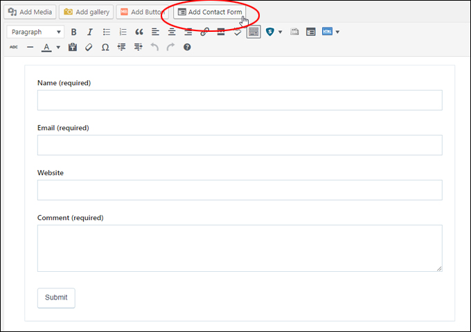
(Jetpack ‘Add Contact Form’ menu button)
![]()
Note: If you find that you are getting too much spam through your contact form, you can add a Google reCAPTCHA to your form …
(Getting too much SPAM through your contact form?)
The screenshot below shows a Jetpack contact form with the reCaptcha Jetpack plugin installed …
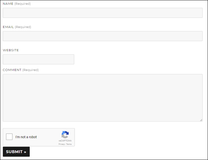
(Add a reCaptcha to Jetpack contact form to prevent spam)
For more details on using Jetpack, see the tutorial below:
Contact Form 7

(Contact Form 7 contact form plugin for WordPress)
With over 1 million downloads, Contact Form 7 is one of the most popular contact form plugins available for WordPress users. Contact Form 7 is a flexible plugin that lets you manage multiple contact forms with easy form customization features and support for 3rd-party plugins that can significantly extend its functionality. Contact Form 7 supports Ajax-powered submitting, CAPTCHA, Akismet spam filtering and many additional features.
To learn more about this plugin, go here:
You can search for more WordPress Contact Form plugins inside your WordPress dashboard (Plugins > Add New), or the WordPress Plugin Directory …

(WordPress Plugin Search – Contact Form)
Search the WordPress Plugin Repository for contact form plugins below:
Congratulations! Now you know how to add a contact form to your WordPress site.
***
"Learning WordPress has been a huge stumbling block for me. I've been looking for something that covers absolutely everything but doesn't cost an arm and a leg. Thank you so much ... you have just provided me with what I have been looking for! Truly appreciated!" - Tanya
***