 In this tutorial, you will learn about the importance of optimizing your WordPress site for viewing on mobile devices.
***
Is Your WordPress Site Optimized For Mobile Devices?
Every day more and more customers are looking for you … on mobile devices!
According to Gartner, the Information Technology research company, from mid-2011 consumers were already spending more time on their mobile devices than on their PCs.
Mobile Internet usage continues to grow and more people use mobile phones to access all kinds of information online.
After experiencing an increase of over 400% in the number of searches being done using mobile devices since the explosion of mobile, Google is also focusing more of their attention on the mobile market.
Google’s own mobile blog points to studies showing that over half of all mobile users are unlikely to return to a website that offers a bad mobile web experience. On the other hand, these same studies show that customers not only embrace sites that are built for mobile, but on websites designed for mobile devices, consumer engagement can increase by as much as 85%.
As Google says, a poor mobile web experience can negatively shape a consumer’s opinion of a brand or company and make it hard for them to engage or make a purchase. According to a survey from Compuware, over 40% of users turned to a competitor’s site after a bad mobile experience.
What this all means, is that if you don’t have a site that works for mobile devices, you’re already missing out. Based on the research quoted above, potential customers are coming to your site, and if they have to struggle with a non-mobile web site on a tiny screen, over half of them will leave and go to your competitor’s site.
Why Your Business Needs A Mobile Optimized Website Right Now
Many businesses are still using static websites, and many of these sites are not optimized for mobile viewing.
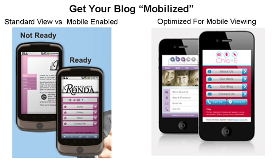 What is a mobile-friendly site? It’s a website that allows mobile users to view your content on their mobile devices. It’s fast to load and easy to use – no ‘pinch and zoom’ is required.
If you already have a website, then you already have a site that can be accessed by any mobile device with a browser. It’s the same thing with a blog.
The problem, however, is that until you create a mobile version of your current website, users only see the “tiny screen” version of your site.
You can see the difference for yourself in the screenshot below …
 The site on the left of the screenshot above has not been optimized for mobile viewing. It’s just a normal web site being “shrunk” by the browser to fit on a mobile screen. The competitor on the right, however, has a mobile-optimized site that detects whenever visitors are looking at the site through a mobile device (e.g. a smartphone) and presents the visitor with the mobile version of their website.
To understand the impact that a site will have on your visitors when viewed through a mobile device, imagine that you decide to set up an online forum for your business to allow your customers to interact with you, ask support-related questions and discuss your products or services with others.
The screenshot below shows what a forum looks like on a website that has not been optimized for viewing on mobile devices …

The above looks pretty bad, huh?
Now consider the online forum website below, which is optimized for mobile devices …

As you can see, mobile optimized websites are easy to read and navigate through, with legible text, readable layouts and large buttons and links.
Responsive WordPress Web Design
Responsive Web Design (RWD) is a Web design approach aimed at crafting sites to provide an optimal viewing experience—easy reading and navigation with a minimum of resizing, panning, and scrolling—across a wide range of devices (from mobile phones to desktop computer monitors). A site designed with RWD adapts the layout to the viewing environment by using fluid, proportion-based grids, flexible images, and CSS3 media queries …
(Source: Wikipedia.org)
Although “responsive web design” is a topic that is clearly more suited for being discussed among web designers, it’s important to understand the basic concept of a responsive theme, as this is the easiest way to make your WordPress site mobile friendly without having to do any coding or have the actual skills and knowledge of a web designer to implement.
Fluid vs Responsive Web Design
Fluid Layouts (also called Liquid Layouts) present your website to users in a way where all the elements are proportionally spaced out and take up the same percentage of space on different screen resolutions, while Responsive Design uses something called ‘CSS Media Queries’ to present different layouts to users based on the screen sizes/type of screen of their devices.
In other words, whereas sites built using “fluid” design generally aim to keep the layout of all elements of the site the same on different sized screens of similar devices (e.g. laptops with different sized screens), sites built using “responsive” design aim to “respond” to the layouts of different devices by adjusting their elements to match the specific type of screen being viewed by the user.
For example, users viewing a site built using a “responsive” theme will see the site’s layout displayed normally on their laptops, but when viewed through their smartphones, the same layout will respond to the smaller viewing area of the mobile device by displaying the content as a single column.
To illustrate the above, take a look at the site below. It uses a responsive WordPress theme called Bhinneka.
When viewed on a desktop PC, the site looks like this …
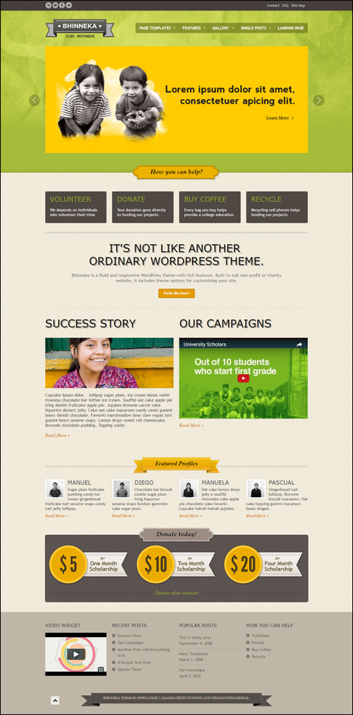 (Bhinneka WordPress Theme – Desktop View)
But when the site is accessed via a mobile device, the theme automatically resizes to display the same site in a mobile viewing format …
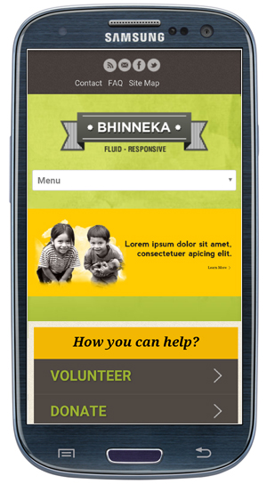 (Bhinneka WordPress Theme – Mobile View)
In this case, the theme designer has created one WordPress theme that works on all platforms (i.e. desktop PCs, laptops and mobile devices).
Many WordPress themes are now incorporating “responsive” design, which means that the theme is “mobile-ready” as soon as it is installed. Combined with the flexibility of WordPress, choosing a responsive theme allows your website to instantly display your content correctly to all users on all devices, whether it be a desktop PC or laptop computer, tablet or smartphone.
Getting Your WordPress Site “Mobilized”
In a nutshell, if your website is not optimized for mobile viewing, you are losing many valuable opportunities online.
Optimizing your website for mobile devices (or even creating a mobile site from scratch) isn’t hard to do, and it doesn’t require you to become a web developer or web designer …
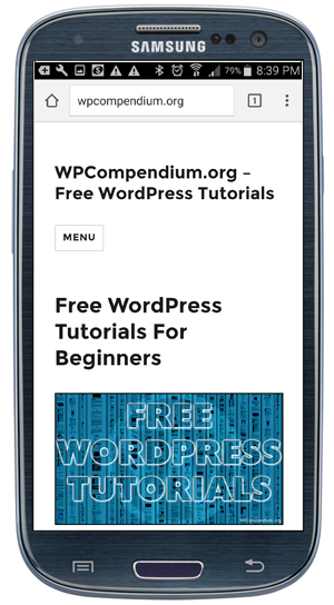
(Most New WordPress Themes Are Mobile Responsive!)
If your existing WordPress site is not optimized for mobile devices, we have outlined several methods and many solutions that will make your WordPress site mobile friendly in a separate tutorial.
To learn how to make your WordPress site mobile friendly, see the tutorial below:
Add Mobile Marketing Strategies To Your WordPress Site Or Blog
We all now carry our mobile devices with us when we go out shopping, working, or spending time with family and friends. There are more than 5 billion mobile phones in use worldwide – almost three times the number of Internet users, and over a billion mobile phones have access to a fast Internet connection.
Even people who can’t access a computer can normally get their hands on a mobile phone.
Now is the time to start adding mobile marketing to your business marketing strategies.
A WordPress site allows you to easily implement a range of mobile marketing strategies quickly and easily. These strategies can include, using QR Codes, creating mobile landing pages, mobile marketing integration with Social Media, and more.
Hopefully, the above has given you a better understanding of the importance of optimizing your WordPress site for mobile use.
To learn how to make your WordPress site mobile friendly, see the tutorial below:
To learn how to test your WordPress site’s mobile friendliness, see the tutorial below:
(Source: Pixabay)
***
"I was absolutely amazed at the scope and breadth of these tutorials! The most in-depth training I have ever received on any subject!" - Myke O'Neill, DailyGreenPost.com
***