How To Configure WordPress For Other Languages

Have you ever wondered if WordPress can be set up to display your content in other languages?
The answer is … yes, absolutely! You can translate WordPress into almost every language available and reach new international markets.
Although WordPress displays content in U.S. English by default, the software has the built-in capability to be used in other languages. WordPress makes available themes and translation files for other languages and provides language support for over 70 languages.
![]()
In this tutorial, you will learn about the international language capabilities of WordPress and how to configure your WordPress site’s default language.
To learn how to easily create a multilingual site using WordPress plugins, see the tutorial below:
How Many Languages Can Your WordPress Site Translate?
The WordPress community has already translated WordPress into over 70 languages and they are currently working on translating many more.
You can set up a WordPress site or blog to display your content in any of the languages below as your site’s default language:
| Afrikaans | Greek | Persian |
| Albanian | Hebrew | Polish |
| Arabic | Hindi | Portuguese |
| Azeri | Icelandic | Romanian |
| Basque | Indonesian | Russian |
| Belarusian | Italian | Sakha |
| Bengali | Japanese | Serbian |
| Bosnian | Javanese | Sinhala |
| Bulgarian | Kazakh | Slovak |
| Chinese | Khmer | Slovenian |
| Croatian | Korean | Spanish |
| Czech | Kurdish | Sundanese |
| Danish | Kyrgyz | Swedish |
| Dutch | Latvian | Tajik |
| Esperanto | Lithuanian | Tamil |
| Estonian | Macedonian | Thai |
| Faroese | Magyar | Turkish |
| Finnish | Malagasy | Uighur |
| French | Malay | Ukrainian |
| Gaelic | Mongolian | Urdu |
| Galician | Myanmar | Uzbek |
| Georgian | Nias | Vietnamese |
| German | Norwegian | Welsh |
Using WordPress In Other Languages
To use WordPress in a language other than English, do the following first:
- Check the above table, or go here to see if WordPress is available in your language of choice: http://codex.wordpress.org/WordPress_in_Your_Language
- If the language you want is not listed, read the “Introduction” section in the above page for alternative options. These options include links to the WordPress Language File Repository and access to translation teams where you can check to see if a translation is currently in progress.
Publishing Your WordPress Site In Other Languages
How To Install WordPress Language Files Automatically
To install an international language version of WordPress automatically, do the following:
Choose Settings > General in the main dashboard menu …
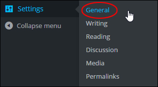
(Settings Menu – General)
This will bring up the ‘General Settings’ screen. Scroll down to the bottom section and select a language from the ‘Site Language’ drop-down menu …
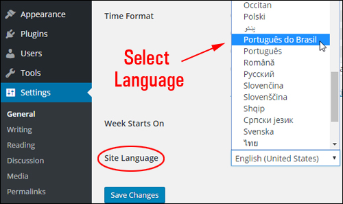
(Select your language)
Click ‘Save Changes’ to update your settings …
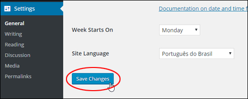
(General Settings – Save changes)
Your WordPress dashboard and all of the default WordPress terms in your installation files will be translated to the language you have chosen …
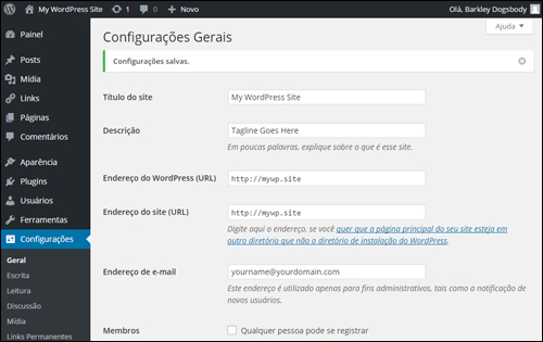
(Your WordPress site has been automatically translated!)
![]()
Translating your default WordPress installation files into another language does not automatically translate your site content into that language. You will need to create content into the language of your choice, or use a WordPress translation plugin
To learn more about translating content in WordPress using translation plugins, see the tutorial below:
To learn more about configuring your WordPress General Settings section, see the tutorial below:
Installing WordPress Language Files Manually
If you can’t translate your WordPress site automatically using the method described in the previous section, you will need to manually install and configure your WordPress site to use translated language files. To manually install an international language version of WordPress, you have two choices:
- You can follow the instructions provided for your language listed here: WordPress in Your Language. These will show you how to install WordPress in another language.
- If instructions are not available, follow the tutorial below to install language files into your WordPress site. This will translate key terms on your site into the language of your choice.
Here are the steps you need to follow to manually install and configure an international language version of WordPress on your site. This will convert the key terms used throughout your WordPress site, but not your actual content. For help translating your actual content, see this tutorial where we explore language translation plugins.
Note: If you make an error in the steps or you do not specify the correct language, WordPress will default back to English. If you need help with these steps please contact a professional developer.
First, download the .mo language file (Machine Object file) for your language (see WordPress in Your Language for help on this). This file is typically included in the translated versions of WordPress …
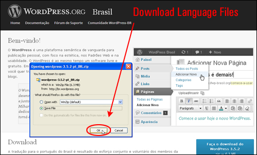
Note: Do not try to edit .mo files directly (you need special software editors to do this).
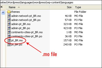
The naming convention of the .mo files is based on the ISO-639 language code (e.g. pt for Portuguese) followed by the ISO-3166 country code (e.g. _PT for Portugal or _BR for Brazil). So, for example, the Brazilian Portuguese file would be called pt_BR.mo, and a non-specific Portuguese file would be called pt.mo.
Note: For a complete list of country codes and language codes see the bottom of this page.
After downloading the language files to your computer, extract the contents and locate the .mo file (typically, this will be located inside the “wordpress > wp-content > languages” directory) …
![]()
Important: Always backup your WordPress files and database before making changes to your WordPress application! If you need help with this step, contact us or refer to our tutorials on how to backup your WordPress files and database.
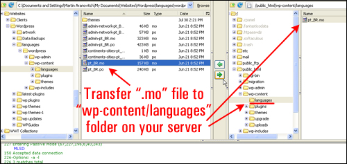
Open up your FTP software and create a new folder in your /wp-content or /wp-includes server directory called /languages. Next, upload the .mo file to the languages folder you have just created in your server …
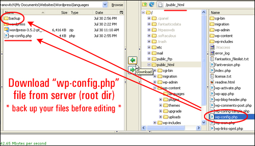
Next, download your wp-config.php to a location on your computer that you will be able to easily find. Note: It’s always a good idea to download an additional copy of files you plan to modify to a “backup” folder …
Open your wp-config.php file in a text editor (remember to always back up your files before making any changes to your WordPress site) and change the following line to add the filename of your language translation file …

Edit this line according to the .mo file you’ve just downloaded. For example, to change your WordPress site to use Brazilian Portuguese, you would change the above line to the following:
![]()
You can also use the above method to change your WordPress default language from en_US to some other variant of English. For example …

Below is an actual example of a wp-config.php file that has just been modified as shown above …

Once you have added your language code, save your wp-config.php file.
Upload the modified wp-config.php file to your WordPress installation root directory, replacing the existing wp-config.php file …
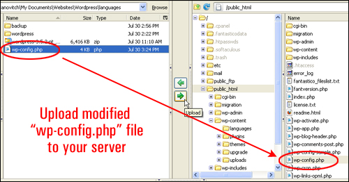
You will be asked to confirm whether you want to overwrite the existing file on your server. Click the “Overwrite” button to proceed …

Once again, ensure that you have a full backup of your WordPress files and data before making any changes to your site. This way, if anything goes wrong, or you just want to restore WordPress to its previous configuration, you can easily reverse any damage by simply re-uploading a copy of the unmodified wp-config.php file you have just backed up to your server, overwriting the newly modified file.
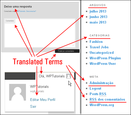
Open your Internet browser and bring up your WordPress site. Your site or blog should now display many of the key terms in the newly-installed language …
![]()
Note: If you are dealing with multiple WordPress site installations (e.g. WordPress MultiSite), then you can either set the language on a per-blog basis through the “Site language” option in the Settings >General subpanel or set the default language for the entire network under the Network Admin > Settings panel (“Default Language”).
Once you have converted the core WordPress terms on your site to the new language, the next step to having your site published in a different language is to translate the content of the site itself. This can be partly achieved through the help of translation or multilingual plugins.
To learn more about translating your content into other languages, see the tutorial below:
How To Translate WordPress Content Into Other Languages Using Plugins
Configuring WordPress For Other Languages – Additional Information
Below are some additional information tables you may find useful regarding using WordPress in other languages:
Country Codes
The ISO 3166 standard defines the following two character codes for many countries and territories:
| AD - Andorra | KZ - Kazakhstan |
| AE - United Arab Emirates | LA - Laos |
| AF - Afghanistan | LB - Lebanon |
| AG - Antigua and Barbuda | LC - St Lucia |
| AI - Anguilla | LI - Liechtenstein |
| AL - Albania | LK - Sri Lanka |
| AM - Armenia | LR - Liberia |
| AN - Netherlands Antilles | LS - Lesotho |
| AO - Angola | LT - Lithuania |
| AQ - Antarctica | LU - Luxembourg |
| AR - Argentina | LV - Latvia |
| AS - Samoa (American) | LY - Libya |
| AT - Austria | MA - Morocco |
| AU - Australia | MC - Monaco |
| AW - Aruba | MD - Moldova |
| AX - Aaland Islands | ME - Montenegro |
| AZ - Azerbaijan | MG - Madagascar |
| BA - Bosnia and Herzegovina | MH - Marshall Islands |
| BB - Barbados | MK - Macedonia |
| BD - Bangladesh | ML - Mali |
| BE - Belgium | MM - Myanmar (Burma) |
| BF - Burkina Faso | MN - Mongolia |
| BG - Bulgaria | MO - Macao |
| BH - Bahrain | MP - Northern Mariana Islands |
| BI - Burundi | MQ - Martinique |
| BJ - Benin | MR - Mauritania |
| BM - Bermuda | MS - Montserrat |
| BN - Brunei | MT - Malta |
| BO - Bolivia | MU - Mauritius |
| BR - Brazil | MV - Maldives |
| BS - Bahamas | MW - Malawi |
| BT - Bhutan | MX - Mexico |
| BV - Bouvet Island | MY - Malaysia |
| BW - Botswana | MZ - Mozambique |
| BY - Belarus | NA - Namibia |
| BZ - Belize | NC - New Caledonia |
| CA - Canada | NE - Niger |
| CC - Cocos (Keeling) Islands | NF - Norfolk Island |
| CD - Congo (Dem Rep) | NG - Nigeria |
| CF - Central African Republic | NI - Nicaragua |
| CG - Congo (Rep) | NL - Netherlands |
| CH - Switzerland | NO - Norway |
| CI - Côte dIvoire | NP - Nepal |
| CK - Cook Islands | NR - Nauru |
| CL - Chile | NU - Niue |
| CM - Cameroon | NZ - New Zealand |
| CN - China | OM - Oman |
| CO - Colombia | PA - Panama |
| CR - Costa Rica | PE - Peru |
| CU - Cuba | PF - French Polynesia |
| CV - Cape Verde | PG - Papua New Guinea |
| CX - Christmas Island | PH - Philippines |
| CY - Cyprus | PK - Pakistan |
| CZ - Czech Republic | PL - Poland |
| DE - Germany | PM - St Pierre and Miquelon |
| DJ - Djibouti | PN - Pitcairn |
| DK - Denmark | PR - Puerto Rico |
| DM - Dominica | PS - Palestine |
| DO - Dominican Republic | PT - Portugal |
| DZ - Algeria | PW - Palau |
| EC - Ecuador | PY - Paraguay |
| EE - Estonia | QA - Qatar |
| EG - Egypt | RE - Reunion |
| EH - Western Sahara | RO - Romania |
| ER - Eritrea | RS - Serbia |
| ES - Spain | RU - Russia |
| ET - Ethiopia | RW - Rwanda |
| FI - Finland | SA - Saudi Arabia |
| FJ - Fiji | SB - Solomon Islands |
| FK - Falkland Islands | SC - Seychelles |
| FM - Micronesia | SD - Sudan |
| FO - Faeroe Islands | SE - Sweden |
| FR - France | SG - Singapore |
| GA - Gabon | SH - St Helena |
| GB - Britain (United Kingdom) | SI - Slovenia |
| GD - Grenada | SJ - Svalbard and Jan Mayen |
| GE - Georgia | SK - Slovakia |
| GF - French Guiana | SL - Sierra Leone |
| GG - Guernsey | SM - San Marino |
| GH - Ghana | SN - Senegal |
| GI - Gibraltar | SO - Somalia |
| GL - Greenland | SR - Suriname |
| GM - Gambia | ST - Sao Tome and Principe |
| GN - Guinea | SV - El Salvador |
| GP - Guadeloupe | SY - Syria |
| GQ - Equatorial Guinea | SZ - Swaziland |
| GR - Greece | TC - Turks and Caicos Islands |
| GS - South Georgia and the South Sandwich Islands | TD - Chad |
| GT - Guatemala | TF - French Southern and Antarctic Lands |
| GU - Guam | TG - Togo |
| GW - Guinea-Bissau | TH - Thailand |
| GY - Guyana | TJ - Tajikistan |
| HK - Hong Kong | TK - Tokelau |
| HM - Heard Island and McDonald Islands | TL - Timor-Leste |
| HN - Honduras | TM - Turkmenistan |
| HR - Croatia | TN - Tunisia |
| HT - Haiti | TO - Tonga |
| HU - Hungary | TR - Turkey |
| ID - Indonesia | TT - Trinidad and Tobago |
| IE - Ireland | TV - Tuvalu |
| IL - Israel | TW - Taiwan |
| IM - Isle of Man | TZ - Tanzania |
| IN - India | UA - Ukraine |
| IO - British Indian Ocean Territory | UG - Uganda |
| IQ - Iraq | UM - US minor outlying islands |
| IR - Iran | US - United States |
| IS - Iceland | UY - Uruguay |
| IT - Italy | UZ - Uzbekistan |
| JE - Jersey | VA - Vatican City |
| JM - Jamaica | VC - St Vincent and the Grenadines |
| JO - Jordan | VE - Venezuela |
| JP - Japan | VG - Virgin Islands (UK) |
| KE - Kenya | VI - Virgin Islands (US) |
| KG - Kyrgyzstan | VN - Vietnam |
| KH - Cambodia | VU - Vanuatu |
| KI - Kiribati | WF - Wallis and Futuna |
| KM - Comoros | WS - Samoa (Western) |
| KN - St Kitts and Nevis | YE - Yemen |
| KP - Korea (North) | YT - Mayotte |
| KR - Korea (South) | ZA - South Africa |
| KW - Kuwait | ZM - Zambia |
| KY - Cayman Islands | ZW - Zimbabwe |
Language Codes
The ISO 639 standard defines two-letter codes for many languages, and three-letter codes for more rarely used languages:
Usual Language Codes
| aa - Afar | lg - Ganda |
| ab - Abkhazian | li - Limburgish; Limburger; Limburgan |
| ae - Avestan | ln - Lingala |
| af - Afrikaans | lo - Lao; Laotian |
| ak - Akan | lt - Lithuanian |
| am - Amharic | lu - Luba-Katanga |
| an - Aragonese | lv - Latvian; Lettish |
| ar - Arabic | mg - Malagasy |
| as - Assamese | mh - Marshallese |
| av - Avaric | mi - Maori |
| ay - Aymara | mk - Macedonian |
| az - Azerbaijani | ml - Malayalam |
| ba - Bashkir | mn - Mongolian |
| be - Belarusian | mo - Moldavian |
| bg - Bulgarian | mr - Marathi |
| bh - Bihari | ms - Malay |
| bi - Bislama | mt - Maltese |
| bm - Bambara | my - Burmese |
| bn - Bengali; Bangla | na - Nauru |
| bo - Tibetan | nb - Norwegian Bokmål |
| br - Breton | nd - Ndebele, North |
| bs - Bosnian | ne - Nepali |
| ca - Catalan | ng - Ndonga |
| ce - Chechen | nl - Dutch |
| ch - Chamorro | nn - Norwegian Nynorsk |
| co - Corsican | no - Norwegian |
| cr - Cree | nr - Ndebele, South |
| cs - Czech | nv - Navajo; Navaho |
| cu - Church Slavic | ny - Chichewa; Nyanja |
| cv - Chuvash | oc - Occitan; Provençal |
| cy - Welsh | oj - Ojibwa |
| da - Danish | om - (Afan) Oromo |
| de - German | or - Oriya |
| dv - Divehi; Maldivian | os - Ossetian; Ossetic |
| dz - Dzongkha; Bhutani | pa - Panjabi; Punjabi |
| ee - Éwé | pi - Pali |
| el - Greek | pl - Polish |
| en - English | ps - Pashto; Pushto |
| eo - Esperanto | pt - Portuguese |
| es - Spanish | qu - Quechua |
| et - Estonian | rm - Romansh |
| eu - Basque | rn - Rundi; Kirundi |
| fa - Persian | ro - Romanian |
| ff - Fulah | ru - Russian |
| fi - Finnish | rw - Kinyarwanda |
| fj - Fijian; Fiji | sa - Sanskrit |
| fo - Faroese | sc - Sardinian |
| fr - French | sd - Sindhi |
| fy - Western Frisian | se - Northern Sami |
| ga - Irish | sg - Sango; Sangro |
| gd - Scottish Gaelic | si - Sinhala; Sinhalese |
| gl - Galician | sk - Slovak |
| gn - Guarani | sl - Slovenian |
| gu - Gujarati | sm - Samoan |
| gv - Manx | sn - Shona |
| ha - Hausa | so - Somali |
| he - Hebrew (formerly iw) | sq - Albanian |
| hi - Hindi | sr - Serbian |
| ho - Hiri Motu | ss - Swati; Siswati |
| hr - Croatian | st - Sesotho; Sotho, Southern |
| ht - Haitian; Haitian Creole | su - Sundanese |
| hu - Hungarian | sv - Swedish |
| hy - Armenian | sw - Swahili |
| hz - Herero | ta - Tamil |
| ia - Interlingua | te - Telugu |
| id - Indonesian (formerly in) | tg - Tajik |
| ie - Interlingue; Occidental | th - Thai |
| ig - Igbo | ti - Tigrinya |
| ii - Sichuan Yi; Nuosu | tk - Turkmen |
| ik - Inupiak; Inupiaq | tl - Tagalog |
| io - Ido | tn - Tswana; Setswana |
| is - Icelandic | to - Tonga |
| it - Italian | tr - Turkish |
| iu - Inuktitut | ts - Tsonga |
| ja - Japanese | tt - Tatar |
| jv - Javanese | tw - Twi |
| ka - Georgian | ty - Tahitian |
| kg - Kongo | ug - Uighur |
| ki - Kikuyu; Gikuyu | uk - Ukrainian |
| kj - Kuanyama; Kwanyama | ur - Urdu |
| kk - Kazakh | uz - Uzbek |
| kl - Kalaallisut; Greenlandic | ve - Venda |
| km - Central Khmer; Cambodian | vi - Vietnamese |
| kn - Kannada | vo - Volapük; Volapuk |
| ko - Korean | wa - Walloon |
| kr - Kanuri | wo - Wolof |
| ks - Kashmiri | xh - Xhosa |
| ku - Kurdish | yi - Yiddish (formerly ji) |
| kv - Komi | yo - Yoruba |
| kw - Cornish | za - Zhuang |
| ky - Kirghiz | zh - Chinese |
| la - Latin | zu - Zulu |
| lb - Letzeburgesch; Luxembourgish |
Rare Language Codes
| ace - Achinese | mai - Maithili |
| awa - Awadhi | mak - Makasar |
| bal - Baluchi | man - Mandingo |
| ban - Balinese | men - Mende |
| bej - Beja; Bedawiyet | min - Minangkabau |
| bem - Bemba | mni - Manipuri |
| bho - Bhojpuri | mos - Mossi |
| bik - Bikol | mwr - Marwari |
| bin - Bini; Edo | nap - Neapolitan |
| bug - Buginese | nso - Pedi; Sepedi; Northern Sotho |
| ceb - Cebuano | nym - Nyamwezi |
| din - Dinka | nyn - Nyankole |
| doi - Dogri | pag - Pangasinan |
| fil - Filipino; Pilipino | pam - Pampanga; Kapampangan |
| fon - Fon | raj - Rajasthani |
| gon - Gondi | sas - Sasak |
| gsw - Swiss German; Alemannic; Alsatian | sat - Santali |
| hil - Hiligaynon | scn - Sicilian |
| hmn - Hmong | shn - Shan |
| ilo - Iloko | sid - Sidamo |
| kab - Kabyle | srr - Serer |
| kam - Kamba | suk - Sukuma |
| kbd - Kabardian | sus - Susu |
| kmb - Kimbundu | tem - Timne |
| kok - Konkani | tiv - Tiv |
| kru - Kurukh | tum - Tumbuka |
| lua - Luba-Lulua | umb - Umbundu |
| luo - Luo (Kenya and Tanzania) | wal - Walamo |
| mad - Madurese | war - Waray |
| mag - Magahi | yao - Yao |
Congratulations … now you know how to translate WordPress into other languages.

(Source: Pixabay)
***
"These tutorials have so much information and are easy to understand. If you use WordPress or plan to in the future these will help you with everything you need to know." - Valisa (Mesa, Arizona)